Over the course of our lives, we step into countless spaces. Some feel instantly familiar — peaceful, grounding, easy to be in. Others feel chaotic or uncomfortable for reasons we can’t quite explain.
So what makes the difference?
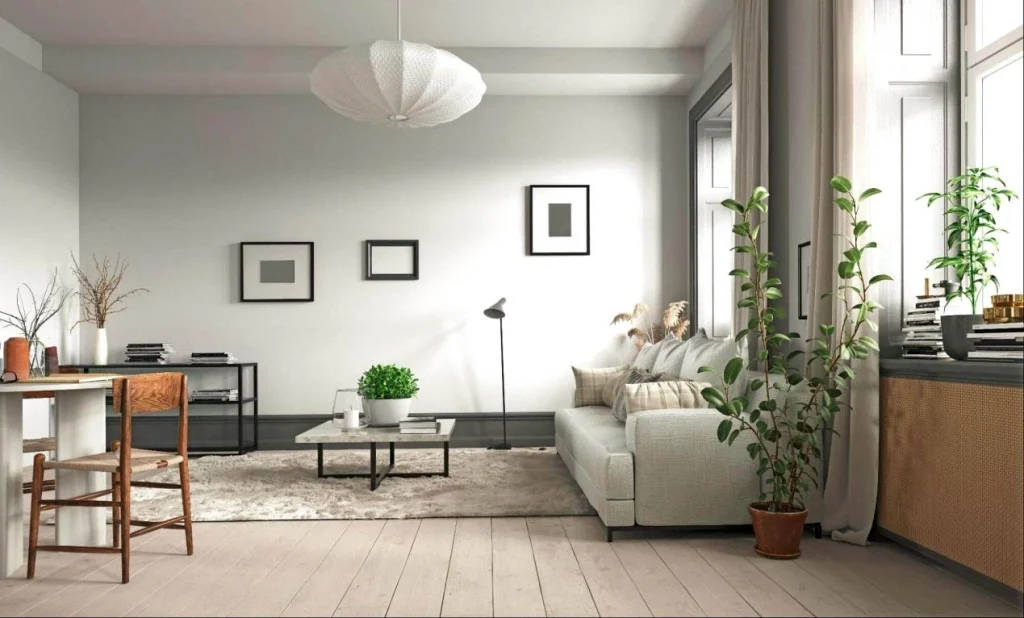
Very often, it’s not luxury or size. It’s clarity. Spaces that are organised, uncluttered, and easy to navigate tend to make us feel lighter and more at ease. When everything has its place and movement feels natural, the mind relaxes without effort. A well-designed space quietly supports us — through layout, lighting, and colour — shaping whether we feel calm or overwhelmed. And since home is where we spend most of our time, this feeling often begins there.
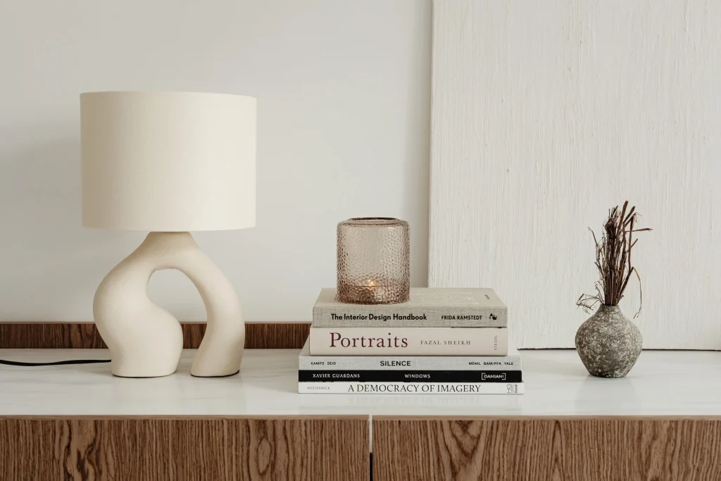
Beyond layout and order, subtler elements play an equally important role. Lighting is one of them.
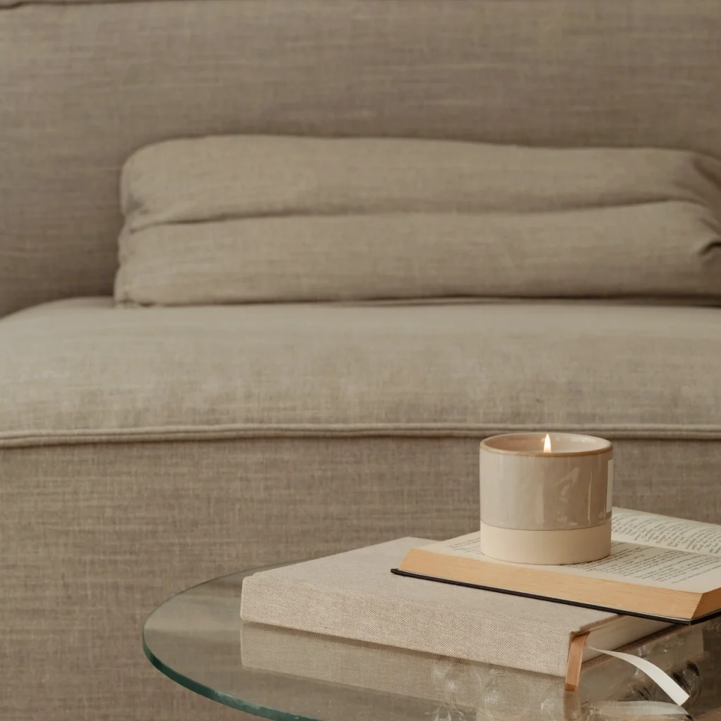
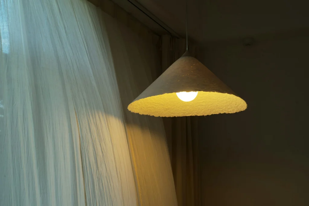
Natural daylight has an undeniable uplifting quality, but artificial lighting can be just as meaningful when used intentionally. A warm lamp in the evening, a soft glow in a reading corner, or gentle ambient lighting during winter months can completely shift how a room feels.
Lighting is a vast and fascinating subject — full of tones, temperatures, and moods. Chosen without thought, it can feel harsh or tiring. Chosen with care, it can transform even the darkest room into a welcoming retreat. The right light doesn’t just illuminate a space; it creates atmosphere — sometimes even comfort that feels emotional rather than visual.
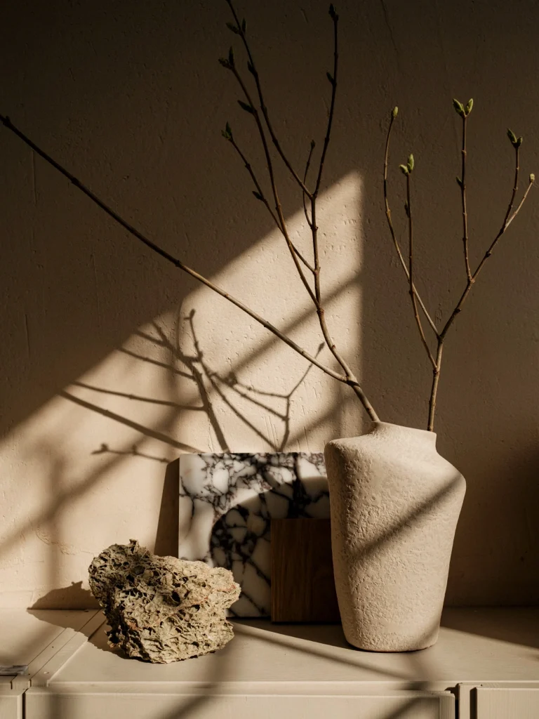
Once lighting is considered, colour becomes the next layer of experience. Colour has a quiet but powerful influence on mood and wellbeing. Our choices are rarely neutral — they speak directly to our nervous system.
Soft, muted tones often encourage relaxation. Beige, for example, carries warmth and timelessness, making it ideal for bedrooms and living areas. Yet too much of any single tone can feel flat, which is why layering matters.
Textures and subtle contrasts bring life without disturbing calm. Linen curtains, velvet cushions, soft wool throws — these details add depth while keeping the overall atmosphere gentle. Pairing beige with light greys or creams can create quiet dimension rather than monotony.
Blue, especially in lighter shades, naturally evokes serenity and openness. Greens — particularly soft sage or muted olive — introduce a sense of nature and renewal. Deeper greens or emerald accents can add richness without overpowering the room. These colours share one important trait: they support calm without demanding attention. They allow the space to breathe.
Calm Is Not a Style — It’s a Relationship
True calm isn’t about following a design trend or copying a magazine interior. It’s about developing a relationship with the space you live in.
It asks for observation, reflection, and small adjustments over time. The most important step is simply noticing how a space makes you feel — and trusting that feeling enough to respond to it.
Because in the end, a calming space is not created by perfection. It’s created by intention.