The Emotional Impact of Color Psychology in Interior Design
How Color Shapes Mood, Energy, and Well-Being at Home
Color is more than decoration.
Beyond aesthetics, color triggers emotional responses and influences productivity, energy levels, mood, and even self-perception.
By understanding the psychology of color in interior design, we can better recognize why we gravitate toward certain hues — and how to intentionally use them to shape the atmosphere of our homes.
Below, we explore the emotional language of color to inspire your next interior transformation.
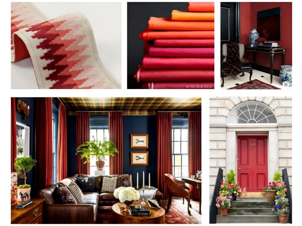
Color Psychology: Red
Energy • Passion • Power
Red is bold and intense. It symbolizes strength and can evoke emotions ranging from passion and confidence to urgency and excitement.
Because of its stimulating qualities, red is often associated with appetite and vitality — which is why it frequently appears in dining spaces.
As a warm-spectrum color with a long wavelength and high energy, red commands attention. Whether used as an accent or dominant shade, it injects dynamism and emotional intensity into a room.
Popular Red Tones in Interior Design
- Deep Crimson– A blue-based, elegant red that conveys refinement. Ideal for velvet upholstery or statement accessories.
- Scarlet– Bright and vibrant. Works beautifully as a bold accent against neutral palettes.
- Burgundy– Deep wine-toned red linked to tradition and luxury. Perfect for textiles like curtains and rugs.
- Terracotta– Earthy red with brown undertones. Warm and grounding, especially in Mediterranean or bohemian interiors.
- Coral– A lively blend of pink, orange, and red. Uplifting and optimistic, perfect for energizing smaller spaces.
In Feng Shui,Red represents the Fire element — stimulating, activating, and transformative when used in balance.
Color Psychology: Green
Growth • Renewal • Balance
Green reflects nature’s vitality — symbolizing renewal, harmony, and abundance. In both color theory and Feng Shui, green is associated with growth, prosperity, and emotional equilibrium.
Its versatility makes it one of the most adaptable interior colors.
Popular Green Shades
- Sage Green– Soft and muted with gray undertones. Calming and ideal for bedrooms and bathrooms.
- Emerald– Jewel-toned and luxurious. Adds sophistication through accent pieces.
- Forest Green– Deep and enveloping. Creates warmth and drama in traditional spaces.
- Mint Green– Light and airy with blue undertones. Brightens smaller rooms.
- Olive Green– Earthy and warm. Pairs beautifully with neutral tones for grounded elegance.
In Feng Shui, green connects to the Wood element — representing expansion, healing, and life force energy
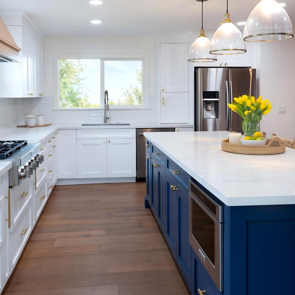
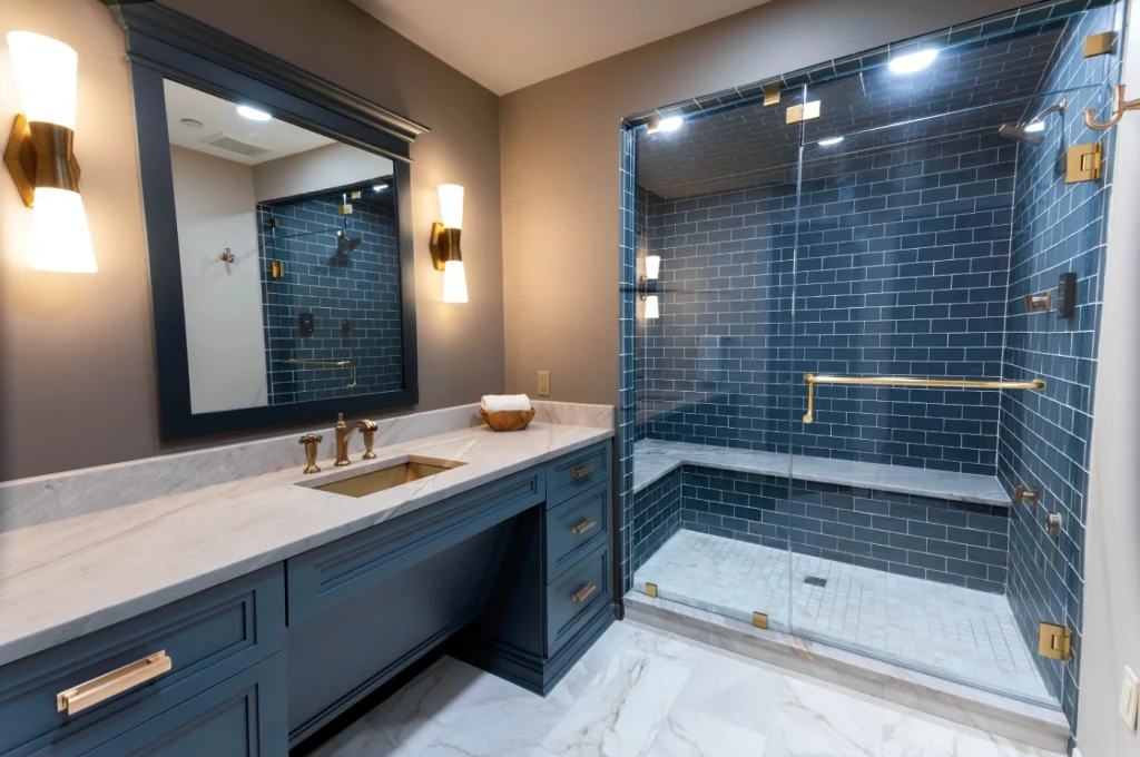
Color Psychology: Blue
Calm • Clarity • Serenity
Blue evokes tranquility, like the sky and sea. It is one of the most universally calming colors, making it ideal for restful environments.
As a cool-spectrum primary color, blue slows the nervous system and promotes emotional clarity.
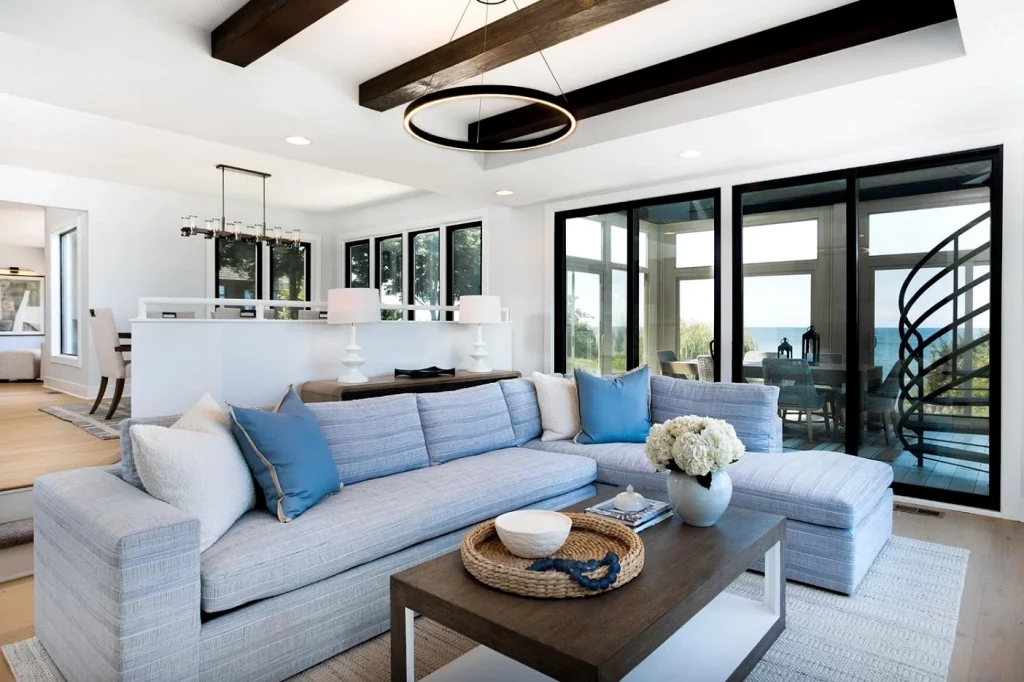
Popular Blue Shades
- Sky Blue– Light and refreshing. Encourages openness and optimism.
- Navy Blue– Deep and sophisticated. Ideal for feature walls or tailored furnishings.
- Turquoise– Energetic yet soothing. Often used in coastal-inspired designs.
- Teal– A dramatic blue-green blend that adds personality and depth.
- Powder Blue– Soft and muted. Ideal for meditation spaces and nurseries.
In Feng Shui, blue aligns with the Water element — supporting wisdom, introspection, and emotional flow.
Color Psychology: Purple
Creativity • Luxury • Spirituality
Purple blends the warmth of red with the calm of blue, symbolizing both passion and introspection. Historically associated with royalty and mysticism, purple introduces depth and imagination into interiors.
Lighter purples feel ethereal and romantic.Darker tones create intimacy and richness.
Popular Purple Shades
- Lavender– Gentle and soothing. Perfect for restful spaces.
- Classic Violet– Dramatic yet versatile. Adds creative energy.
- Plum– Deep and luxurious. Ideal for statement walls or textiles.
- Mauve– Muted with gray undertones. Elegant and understated.
- Lilac– Soft and romantic. Encourages calm and emotional comfort.
In energy design, purple resonates with higher awareness and intuition
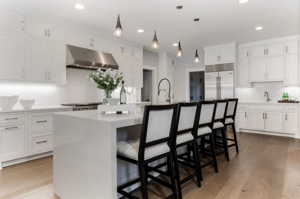
Color Psychology: White
Clarity • Purity • Spaciousness
White reflects all visible light. It symbolizes simplicity, openness, and clarity.
In interior design, white enhances light and spatial perception, making rooms feel larger and more breathable.
However, white must be thoughtfully chosen — undertones matter.
Popular White Variations
- Pure White– Crisp and modern. Maximizes light reflection.
- Warm White– Soft with beige or yellow undertones. Inviting and cozy.
- Ivory– Creamy and refined. Adds warmth without heaviness.
- Vintage White– Slightly muted with gray or beige hints. Ideal for rustic or French-inspired interiors.
In Feng Shui, white corresponds to the Metal element — clarity, focus, and refinement.
Designing with Emotional Intelligence
When we understand the psychology behind color theory, we move beyond decoration.
We begin designing with intention.
Whether you seek serenity, warmth, or inspiration, intentional color use creates balanced, harmonious environments aligned with both psychological well-being and energetic flow.
A well-designed space does more than look beautiful.
It feels right.